
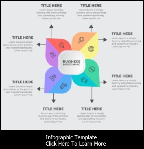


In today's fast-paced digital landscape, the ability to convey complex information quickly and effectively is paramount. Enter infographics - a dynamic fusion of design and information that transcends language barriers and captures attention. Behind every impactful infographic lies a carefully crafted blend of elements that work in harmony to tell a compelling visual story. Let's dive into the five key elements that make up an infographic's DNA.
1. Visuals: Painting a Thousand Words
At the heart of every infographic are visuals that communicate concepts, data, and ideas at a glance. Visual elements encompass a range of components, from icons and illustrations to images and charts. Well-chosen visuals not only enhance aesthetics but also serve as vehicles to convey information concisely and engage the audience emotionally. Icons can symbolize concepts, images can provide context, and charts can distill complex data into digestible insights.
2. Text: Guiding the Narrative
Textual content in an infographic plays a crucial role in guiding the viewer's understanding. This includes headings, subheadings, labels, captions, and explanatory text. Text should be concise, clear, and organized hierarchically to direct the reader's attention and guide them through the visual story. Effective use of typography enhances readability and reinforces the overall design aesthetic.
3. Layout: Structuring for Impact
The layout of an infographic determines how its various elements are arranged and interact. A well-designed layout ensures that information flows logically and intuitively, preventing visual clutter. It should guide the reader's eye from one element to another in a structured manner. Proper spacing, alignment, and balance contribute to a visually pleasing experience, enhancing the infographic's effectiveness.
4. Color: Conveying Emotion and Meaning
Color is a powerful tool that evokes emotions, establishes brand identity, and aids in information hierarchy. The strategic use of color enhances visual appeal and guides readers through the content. A consistent color scheme maintains cohesiveness, while contrasting colors draw attention to key points. Color coding can also be employed to group related information or data.
5. Data Visualization: Unveiling Insights
Infographics often involve presenting data, and data visualization is the art of transforming raw numbers into meaningful insights. Charts, graphs, and diagrams are fundamental data visualization tools that help readers understand trends, comparisons, and relationships. The choice of visualization type depends on the nature of the data and the story you're trying to convey.
By harmoniously combining these five elements, infographics become compelling vehicles for information delivery. The effectiveness of an infographic lies in its ability to distill complex ideas, stimulate visual engagement, and facilitate quick comprehension. Whether you're conveying scientific research, explaining a process, or sharing statistics, mastering the art of infographics empowers you to communicate with impact in a world where attention spans are fleeting.
Incorporating visuals, text, layout, color, and data visualization effectively transforms a mere image into an engaging and informative visual story that resonates with audiences and leaves a lasting impression.
- A Guide to Different Types of Infographics
- Cooking Up Visual Delights: The Role of Infographics in Cookbooks
- Decoding Visual Communication: Infographic vs. Poster
- Five Types Of Infographic Articles
- Infographics in Press Releases: Communicating Complexity with Clarity
- The Art of Visual Storytelling: Unveiling the 5 Key Elements of Infographics
- The Power of Infographics: Enhancing Articles with Visual Storytelling
- Transforming Content: 7 Engaging Types Perfect for Infographics
- Visual Persuasion: Leveraging Infographics in Sales Brochures as a Powerful Marketing Tool
- Visual Powerhouse: Harnessing the Impact of Infographics in Presentations