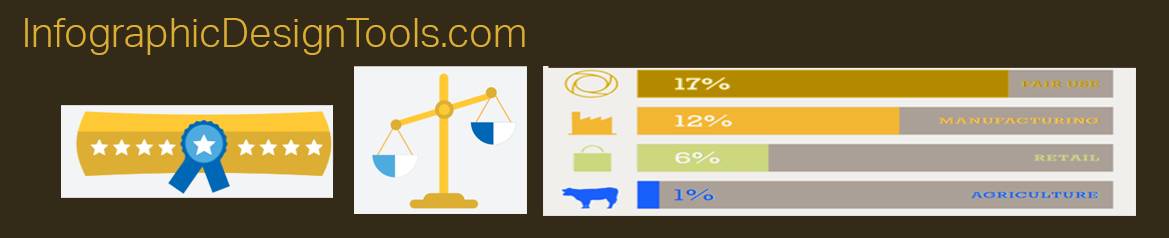
1. Statistical Infographics: Making Numbers Speak
Statistical infographics are perhaps the most common type. They transform raw data and statistics into visually compelling charts, graphs, and diagrams. Bar graphs, pie charts, line charts, and scatter plots are all examples of statistical infographics. These visuals help illustrate trends, patterns, and relationships in data, making it accessible to a wider audience.
2. Informational Infographics: Breaking Down Concepts
When complex concepts need simplification, informational infographics step in. These infographics use a combination of text and visuals to break down intricate subjects into easy-to-understand bits. They're often used in educational contexts, explaining scientific processes, historical events, or technological advancements.
3. Timeline Infographics: Tracing Events Through Time
Timeline infographics are perfect for depicting historical events, project milestones, or any sequence of events over time. They present a linear representation of events, helping readers understand the chronology and context of important occurrences. From ancient history to modern advancements, timeline infographics are a visual journey through time.
4. Process Infographics: Guiding Step-by-Step
Process infographics provide a visual guide to completing a series of steps or tasks. These infographics are often used in how-to articles and tutorials. Whether it's a recipe, DIY project, or technical instructions, process infographics break down each step visually, aiding comprehension and implementation.
5. Comparison Infographics: Weighing Options
When you need to compare different options, products, or concepts, comparison infographics come to the rescue. These infographics highlight the strengths and weaknesses of each option, aiding decision-making. They often feature side-by-side comparisons and pros-and-cons lists.
6. Geographic Infographics: Mapping Information
Geographic infographics use maps and geographical data to convey information related to locations, populations, or trends across regions. They're particularly useful for illustrating demographic data, environmental changes, and geopolitical insights.
7. Hierarchical Infographics: Showing Structures
Hierarchical infographics visualize relationships within a hierarchy or structure. They're often used to present organizational charts, family trees, or classification systems. These visuals help readers understand the levels of authority, relationships, and connections between different entities.
8. Flowchart Infographics: Navigating Options
Flowchart infographics provide a decision-making framework by presenting a series of choices and outcomes. They're interactive in nature, leading readers through a series of decisions and responses, ultimately guiding them to a conclusion. Flowchart infographics are valuable for explaining processes with multiple possible paths.
9. Narrative Infographics: Telling a Story
Narrative infographics combine visuals and text to create a storytelling experience. They're used to convey a sequence of events, a cause-and-effect relationship, or a narrative arc. Narrative infographics engage readers by guiding them through a structured story, making them ideal for historical accounts and case studies.
10. Statistical Maps: Visualizing Data Spatially
Statistical maps use geographical representations to illustrate data variations across regions. Heat maps, choropleth maps, and dot distribution maps are examples of statistical maps. They help reveal spatial patterns and trends in data, making them useful for illustrating geographic trends.
In a world where information is abundant, infographics serve as valuable tools for simplifying and enhancing communication. By choosing the appropriate type of infographic for your content, you can effectively engage your audience and convey your message in a visually compelling and memorable manner.
- A Guide to Different Types of Infographics
- Cooking Up Visual Delights: The Role of Infographics in Cookbooks
- Decoding Visual Communication: Infographic vs. Poster
- Five Types Of Infographic Articles
- Infographics in Press Releases: Communicating Complexity with Clarity
- The Art of Visual Storytelling: Unveiling the 5 Key Elements of Infographics
- The Power of Infographics: Enhancing Articles with Visual Storytelling
- Transforming Content: 7 Engaging Types Perfect for Infographics
- Visual Persuasion: Leveraging Infographics in Sales Brochures as a Powerful Marketing Tool
- Visual Powerhouse: Harnessing the Impact of Infographics in Presentations